Monday, 20 December 2010

Noma Bar


I just recently encountered some of the work of Noma Bar in an online interview at grain edit.
The images are an embodiment of graphic explicitness in illustrative form. The way Bar expresses a concept in such a visually simple way brings new life to old saying a picture is worth a thousand words. To support this here is a small extraction from the interview:
                          
           How did you come to develop this style?
I’m attracted to actors that don’t use words. Maybe it is because I come from a foreign country and I have to do a lot of non-verbal communication. Comedy really influences me. I admire silent films because they have the ability to make people laugh without saying any words, basically doing visual things without talking. My work is like a comedy dialogue, short jokes, short stories. It quite similar to comedy in that it ends with a punch line.

Monday, 22 November 2010

One Dot Zero

a couple of weeks ago One Dot Zero held thier adventures in motion festival at the BFI Southbank and I was lucky enough to get on the press list for the opening night of the event. the week consisted some of the best animation from the creme of the europian crop, here is the taster


onedotzero_adventures in motion 2010 preview from onedotzero on Vimeo.

You can read my review of the event that I wrote for FAD magazine here

Mark Reeve

Recently I met with award winning Illustrator/cartoonist Mark Reeve and he was good enough to let me pick his knowlege for an hour as he showed me some illustrations.Some of the more notable tasks of his career are working on charicter design for the television show- Spitting Image, charicter design for ITV's Headcases, comic strips for DC Comics and extensive work in storyboarding for television. Mark is also known for his satyrical editorial illustration for The Mail On Sunday. The topic of discussion was the rise of digitally rendered illustration and how Mark had been teaching himself to use programs such as Photoshop to keep up.
 

Jamie Shovlin

Some nice drawing I found from one of the Saatchi galleries featured artists- Jamie Shovlin.

Milgi Window Drawing from Ben Smith on Vimeo.


Builtbypeople - Yeti from Simon Spilsbury on Vimeo.

I have been asked to paint a window display for madame ettas seafood kitchen in Brixton Village so I had a look at how people generally go about it and these were my favorites

Chris Bourke


A selection of small thumbnails of prints done by artist Chris Bourke, taken from his website here

The images have a definite appeal due to their stark contrast and graphic line. The content however deals mostly with symbolism of a very typical nature which does undermine the originality of the work. visual cliche's such as sculls, scrolls, sparrow's, daggers and hearts form the majority of the content which on one level gives a taste of the overall angle of the prints but leaves no real lasting impression. Still nice saleable prints.

Tuesday, 2 November 2010

Monday, 1 November 2010

Charlie Bronson


I recently had the good fortune of acquiring a Charlie Bronson original or ,as he is now known- Charles Salvador, which I gave as a gift to my father for his birthday. If you think that giving someone a gift that was made by a man who spent 36 years in  solitary confinement a little strange then perhaps it is but can you say that you have ever seen a piece of art like it before? its certainly not a pretty picture.
Michael Gordon Peterson AKA Charles Bronson/Salvador was caught in 1974 for armed robbery and was sentenced to seven years imprisonment since then he has only spent 69 days as a free man the rest has mostly been in solitary confinement. The press have labelled him as Britain's most violent prisoner although he has never murdered anyone and it seems that the judicial system has turned their back on him. One of the only joys of his life in recent years has been to produce art- a privilege that was recently taken away. His drawings offer an insight into a life that the art world has never seen before, they tell the chilling story of a man in captivity, a prisoner of his own mind.


Iain Macarthur

OK now I'm getting to the real juice


Iain Macarthur is brilliant and the only reason I have to justify that is because his intricate illustrations make my mouth water. Is it a question of taste? why is illustration so subjective? when I asked my boss he said that graphic violence in illustration is becoming common and is unsavory.
when I ask friends they appreciate mostly trendiness and graphic design esk style.
I turn it round and round in my head but still all that matters is that these images ignite my creative arousal.


Recently I was told that it is important to strip down my illustrative style to reveal a side to it that is commercially viable and in the process of pondering how to respond to that I see more and more examples of illustrators who seem to share a common goal- to produce rich and giving imagery that contains information from corner to corner and registers with an impact that is phenomenal.

Mcbess

I was recently looking through a magazine when i was pulled in by imagery that I could only describe as tasty.
It was the work of contemporary french illustrator Matthieu Bessudo aka Mcbess.


 Mcbess says "developing your style is a long process, but its rewarding- like growing a beard." the question of someones 'style' is something that is usually frowned upon ,in education at least and I have to wonder why?

I understand that one could be drawn into the trap of becoming pigeon holed like poor old Louis wane who drew cats for the majority of his illustrative career. I also understand that these things often work in trends, hot may one day be not, such as in the case of illustrator Chris Foss who suffered from the overnight shift in interest from airbrush art.

Then I look at the work of Mcbess and think, who cares? his drawings are like ink liquorish. His images are rich with the quirk and the cool, I may well end up buying one of these.


Tomi ungerer


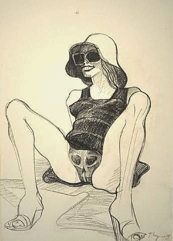
Some works from french illustrator Tomi Ungerer. Its not so much the mark making which i appreciate here, more the message and graphic style which registers as quite symbolic. His work is noted for its links to eroticism however Ungerer is perhaps best known for his work in childrens books. Here he is giving some sound advice:


The hunting of the snark

Henry Holiday's illustrations for the Hunting of the Snark, here it is:
roughly 134 years since the publication of the hunting for the snark and Holiday has still got it going on! take a look- if they were done yesterday he would be the only illustrator in modern day to be doing this. I don't proscribe to the idea of simplifying editorial illustration as we have seen in recent years (by this I mean the long lasting trend of naive illustration). I believe illustrators should be doing more in the way of intricacy, admittedly the subject of these images is a little on the dark side but I am referring to the skill and penmanship- such  things would surely enrich our lives today. I'm not saying make all art this way but everything has its place and I think its time that this fashion came back around.
 that we can all look forward to seeing more of this sort of "handskill" work in books, posters, magazines and advertising.


Istvan Orosz

http://web.axelero.hu/utisz/page.htm


I came across this artists work today, completely skillfull, mind boggling and stunning.
Istvan Orosz is a Hungarian painter, printmaker, graphic designer and animated film director, is known for his mathematically inspired works, impossible objects, optical illusions, double-meaning images and anamorphoses. The geometric art of István Orosz, with forced perspectives and optical illusions, has been compared to works by M. C. Escher.


 The section I found particularly interesting was the
section on anamorphoses, where the artist has produced a rather stunning image that when placed next to a reflective cylindrical container the reflection reveals yet another astonishment.


Wednesday, 20 October 2010

Peter Kuper on Franz Kafka


Here are two of artist Peter Kuper's graphic novels that illustrate some of the works of Franz Kafka (renowned Czech author ). The fist one give it up is a collection of illustrated short stories and the second one an illustrated version of Kafka's The Metamorphosis. These are in here because I like their lino-cut-esk style (I don't actually know if these are prints or drawings). I think its his use of positive/ negative space and light that make these illustrations so striking.


Tom Gauld the Gigantic Robot

We had Tom Gauld come into the university as a visiting practitioner a couple of weeks ago and I found this story in particular to be of interest. The way Tom talks about this book and his approach to humorous/tragic illustrations in a really open way is really inspiring. The Gigantic robot is about a robot who is built as a secret weapon but never used. Tom's stark image and stripped down style work well to tell this wonderfully sad story. His commercial 'style' seems to be the result of experimenting with quirky and simplistic imagery, I like this book more than some of Tom's other works- perhaps because his humor and style lend itself to this story well.